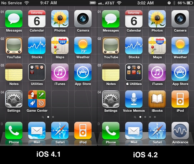
Apple tweaked the home screen icon layout in iOS 4.2

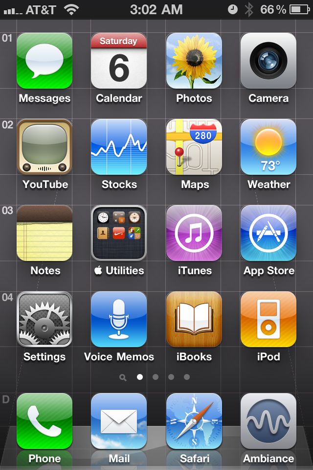
I have been using this grid iPhone wallpaper for awhile now and it lined up perfectly until some recent 4.2 build. Notice that in the iOS 4.2 screenshot, the icons in columns 3 and 4 appear to be shifted to the right by 1 pixel. The pixel shift probably won't affect anybody except for wallpaper designers. I wonder why they did this?
UPDATE: 11/06/2010
It also appears that the corner radius has been adjusted slightly as well. In iOS 4.2, they seem to have shaved a bit more off the corner to make the radius a tad bigger. It is strikingly apparent in the Stocks, Calendar and Messages apps. This might have an impact on any developer who has fine tuned their icon in the corner for highlights, borders or whatever and some might have to be edited for this new corner radius.

Was this page helpful for you? Buy me a slice of 🍕 to say thanks!

Comments