About User Interface Sounds in Chicago Bikes

Normally I don't respond to iTunes App Store reviews about my apps, but I saw this one today and thought it needed a response and justification for the design decision to include interface sounds in the Chicago Bikes App that are enabled by default.

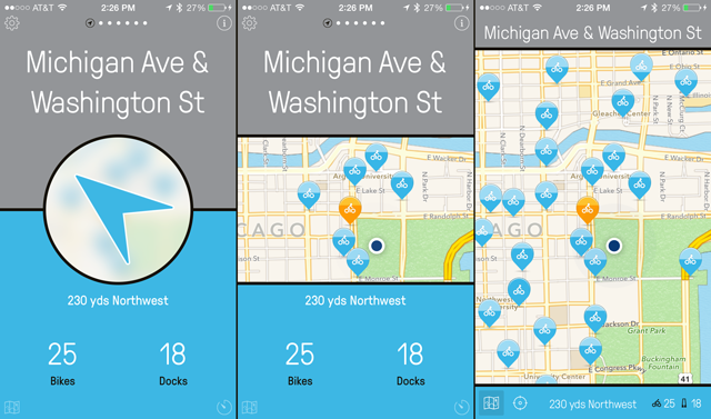
Chicago Bikes is a simple and easy-to-use App that helps you locate the closest Divvy Bike℠ docking station. With one tap you can find the closest Divvy Bike station, how far away it is and in which direction, and how many available bikes and docks it currently has.
When designing this app, along with all of our other Bike Share Apps, I spent a lot of time interviewing bike riders, distributing beta copies, iterating on feedback and fine-tuning the UI and UX based on the findings.
There are two major settings where a person will use these apps:
- At a standstill looking for a bike.
- On a bike, looking for a docking station.
The decision to have sound effects on interaction was made based on how the customer uses the app in setting 2, on a bike. While riding, they tend to keep their eyes on the road — for obvious reasons — and briefly glance down briefly at the app to gain information quickly and safely.
If the interface is tapped — whether the tap was intentional or not — and there is no indication that something was manipulated, then this has the potential to confuse the rider upon next glance. It's not a stretch to say that a little confusion when riding a bike could lead to more time spent looking at the app to figure out its state. More time spent looking at the app while riding a bike increases the chances of an accident or worse.
An audible "tink" gives the rider a non-visual cue that they tapped something, so they know without looking that the interface is changed from what it was before. Whether the tap was intentional or not, a sound effect as feedback was a way to keep the rider fully aware of the state of the app and keep their eyes on the road.
Given the alternative, I decided is much better to have sounds on by default for riders in situation #2. If a certain user doesn't like the sound effects, the app has an on/off switch that only needs to be set once, and every phone has a silence switch directly on the hardware.
I suspect this Tremontane user was annoyed by the sound effects when using it in an office setting. Maybe s/he will see value in the sound effects when riding a bike later on — maybe not — but a 2-star review is hardly warranted here for a feature that could end up saving somebody's life.
Lastly, I run a small software company called Urban Apps. It pays the bills so I can take the time to think about design decisions like this. If you found this page helpful at all, I would really appreciate it if you would check out my Apps on the iTunes App Store.
Was this page helpful for you? Buy me a slice of 🍕 to say thanks!

Comments